Helvetica is probably one of the most dominant typefaces in use today. Described as clean, modern, and versatile, it has imprinted itself onto graphic design, advertising, branding, and a variety of media both on and off the computer. This paper traces the history of the font, its characteristics, and its uses, which highlight the numerous versions and reasons it became so far ahead of its peers.
What is Helvetica font?
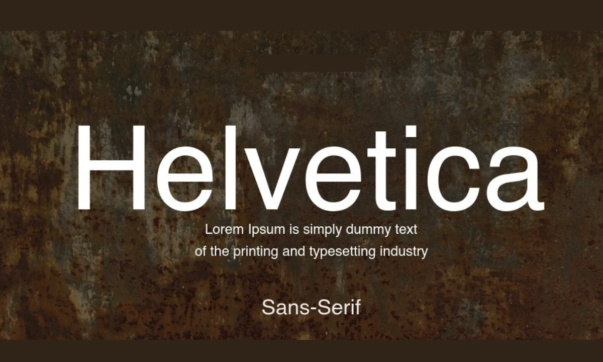
Helvetica is a sans-serif face that Max Miedinger, Swiss type designer designed back in 1957, in collaboration with Eduard Hoffmann. It was originally named “Neue Haas Grotesk” and later retitled to Helvetica from the word “Helvetia, the Latin name for Switzerland. Helvetica was designed in a neutral form and maximum legibility that made them suitable for almost all of the applications.
Key Characteristics of Helvetica Font
Helvetica is simple, clean, and modern. Below are its characteristics.
- Sans-Serif Style: This font is sans-serif. The tiny features known as “serifs” at the ends of strokes are mostly absent from this style of font.
- High x-Height: The most readable high x-height improves the readability of the copy even at small point sizes.
- Uniform Stroke Width: Helvetica keeps uniform stroke width with no contrast, which makes it appear smooth and even.
- Neutral and Balanced Design: Neutral in nature, thus meant for formal as well as informal usage.
- Simple Letters: Helvetica has lettering in clear and simple styles with close spacings and high ascenders that make it readable.
History and Development of Helvetica Font
| Year | Event | Description |
| 1957 | Helvetica Design | Max Miedinger and Eduard Hoffmann created the font for Haas Type Foundry. |
| 1960 | Helvetica Name | Renamed the name from “Neue Haas Grotesk” to “Helvetica” for the international market. |
| 1983 | Helvetica Neue Launched | The improved version with more space and increased character count. |
| 2007 | 50 Years of Helvetica | Documentary Film on Helvetica |
| 2019 | Helvetica Now A new version, | with new weights and digital-use permutations. |
Helvetica Font Variations
There are several variations of Helvetica; each version was created for a particular
- purpose:Typographic Use. The original, it is used for body text
- Helvetica Bold: Stronger and more dramatic, it’s used for headings and titles to highlight particular words.
- Helvetica Light: It’s leaner and is therefore for esthetic use when you need to be sensitive and classy.
- Helvetica Neue: This is the revamped model of the original classic, including other weights, better spacing, and being used in digital environments.
- Helvetica Now: A re-cut for the digital world, refined and augmented.
Why Is Helvetica So Popular?
There are few reasons that the Helvetica font has remained so popular over the years:
- Versatility: A clean and neutral design that allows it to be used in a wide variety of contexts, from corporate branding to casual communication.
- Legibility: Highly readable in small, as well as large, size ranges, making it suitable for everything from business cards to billboards.
- Timeless Character : Helvetica, from a design point of view, is both classic and modern, giving it its timeless quality which makes it continue to be relevant for decades.
- Common Usage: Several companies and organizations use Helvetica as their logos and branding, thus further solidifying its position as one of the most sought-after typefaces.
- Digital Adaptation: Helvetica Neue and Helvetica Now are some of the variations that have made the font conform to the needs of digital design, making sure this font will not fade anytime soon.
How to Use Helvetica Font Wisely
While working with Helvetica in your designs, there are some tips as follows:
1. Combination with Other Fonts
- Use serif fonts like Times New Roman or Georgia along with Helvetica. This would be an eye-catching contrast while using the combination of Helvetica.
- Use different weights of Helvetica such as Light, Regular, and Bold to have hierarchy in your design.
2. Letter Spacing and Alignment
- Adjust the letter spacing (kerning) of titles and headings to look sleek.
- Use regular or light weights for body copy so it can easily be readable.
3. Colour Selections
- Helvetica is a flexible face that works well in both black and white and colored designs.
- Use bold colors for headings and reserve the neutral tones for body text.
Advantages and Disadvantages of Helvetica
Advantages | Disadvantages |
| Very readable and versatile. | Overused in certain applications. |
| Timely and color-neutral design | Doesn’t have personal character as compared to the ornamental type of fonts |
| It comes in a wide variety of weight and variation | options Quite corporate or chilly in some of the designs |
| Supported in various | channels Not appropriate to all cultures |
Notable Brands Using Helvetica
Today, many major brands and companies have opted for Helvetica as a
part of their identity:
- Apple: They used to employ it for marketing and interface design.
- BMW: In its branding, the German automobile company uses Helvetica.
- American Airlines: Its Helvetica is clean and professional.
- Toyota: Helvetica’s use as a typeface for the advertisements of the company gives them a very stylized modern look.
Frequently Asked Questions on Helvetica Font
Q1: Is Helvetica font free to use?
Helvetica is a paid font, and you can only access it after purchasing it or signing up for design software through Adobe Creative Cloud.
Q2: How to download Helvetica for my computer?
Once you have paid for the Helvetica font, download the file and double-click to install the font. It works both for Windows and for Mac operating system.
Q3: What are some alternative fonts to Helvetica?
Other sans-serif alternatives that are commonly available are Arial, Roboto, Open Sans, and Univers.
Q4: Why is Helvetica one of those fonts that don’t seem to have an age?
It is a clean, neutral design and has survived for use with more media than most typefaces have ever been commissioned for-and thus become an immortal font for designers.
Q5: Can I use Helvetica for web design?
Sure, but you will likely just have to use a web-safe equivalent or load it in via a font service like Google Fonts in order to get cross-browser compatibility.
Conclusion
Helvetica remains one of the most used and most influential typefaces of all time. Clean lines, versatility, and legibility have thus made it a choice among graphic designers, advertisers, and companies worldwide. Whether in the corporate logo and website design or simple print material, Helvetica can furnish a modern, professional look that translates well to audiences through different media.
Also Read About


